Grocery prices have certainly risen over the last few years, and I’ve written about this a few times before. However, recently there’s been a trend on social media of people “posting their receipts” to show how much grocery prices have gone up. Unfortunately, very few people actually post their entire receipts, and often they just show the total amount, which can be confusing. The absurd claim that prices have risen 250% in the past two yearsThis is in stark contrast to the BLS CPI “meals at home” category, which shows a 4.7% increase from July 2022 to July 2024. (The exact dates of the receipts are also unclear in the video, he simply says “two years.”) Depending on the exact base month, that’s 20-25% compared to pre-pandemic or early-pandemic times using the BLS data.
What if you actually looked at the receipt? I attempted such an exercise in November 2023, when social media videos resurfaced claiming that prices had gone up. Doubling My personal receipts matched the corresponding BLS data fairly well, even though it was only one Sam’s Club receipt with only eight items (which may not match the grocery store for a variety of reasons). I couldn’t find any suitable receipts from 2019 or 2020 at the time (Kroger and Walmart delete old receipts from your account after about two years), but after combing through my old email accounts, I found two more receipts I could compare, both from Walmart in 2019 and 2020, with more items than the Sam’s Club receipt (each contained about a dozen and a half items, a fairly common grocery purchase, and I was able to find a match today).
I’ll show you the receipt!
October 2019
First, here is my Walmart receipt from October 2019: Here is the original receipt (click!), and here is most of the groceries I repurchased this week (August 2024): I only used food items in this exercise because I couldn’t find exact substitutes for the non-food items (like plastic forks) (my non-food item was a small potato).
A comparison of receipts for October 2019 is shown in the table below.
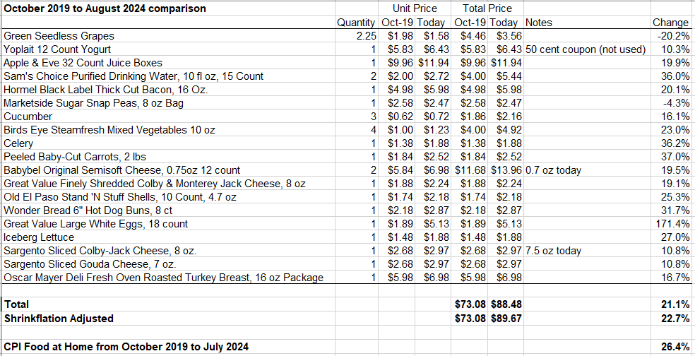
I was able to find most of my items, and most were the exact same brands. I double-checked all package sizes to account for shrinkflation. There were two items (both cheeses) that had slightly smaller packages, so I factored this into the “Shrinkflation Adjusted” line. Of course, some items have gone up quite a bit, like the astounding 171.4% increase in eggs. If you pay attention to egg prices or really love eggs, this may be why you think grocery prices have doubled, etc. But this is the exception.
Notice some price drops. One is for blue grapes, down 20%. This could be seasonal (I’ll check prices again in late October), but if I remove grapes from the analysis, the situation remains the same (total increase is 23.8%, 25.5% after shrinkflation adjustment). I also had a small coupon for yogurt that I didn’t use in my calculations (although I could have).
Note that in the October 2019 comparison, the BLS says grocery prices increased 26.4%. My receipts are no higher than that. Even if you use shrinkflation-adjusted prices and remove the grape outlier, my receipts are still a percentage point lower. But whatever numbers you use, they’re basically just approximate. In the 20-25% range. Not 100% or more.
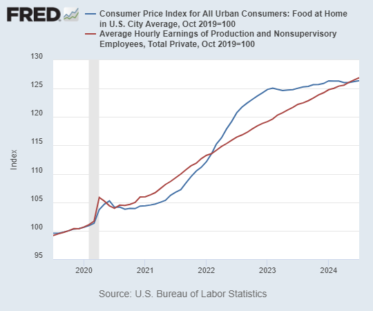
Below is a chart showing the BLS “Food at Home” heading from October 2019, along with average wages for comparison.
October 2020
I’ll show the original receipts again (click!) for October 2020, and also show repurchases for this week (August 2024).
My comparison is below:
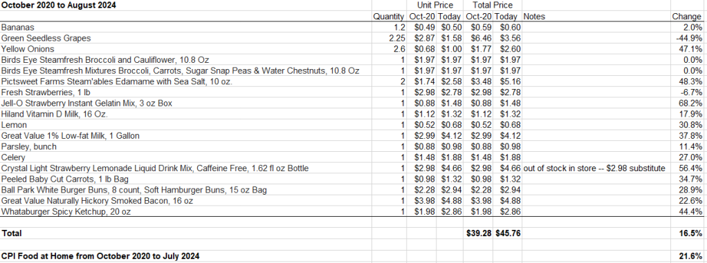
Some items have gone up in price quite a bit! Jello, for example. Frozen vegetables, however, have not increased in price (I was unable to find Green Giant Honey Roasted Sweet Corn). Also, Crystal Light Strawberry Lemonade is out of stock and will be shipped by a third party vendor, which is quite expensive, but… Regular Lemonade In stock, prices are exactly the same as in October 2020 (no inflation again!). If we again exclude the extraordinary price drop in grapes (maybe a seasonal issue) and also get the regular lemonade, the overall total is up 23.4%. This is slightly higher than the 21.6% reported by the BLS for this period, but about as expected. The 20-25% rule of thumb applies again.
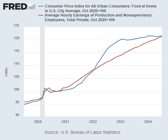
Below is a graph of food prices and average wages since October 2020.
Show me the receipt!
As with previous posts on this topic, some may suspect that my receipts are somehow cherry-picked or just a weird outlier (Did I order too little? Not enough meat? Arkansas is different?). Fair enough! I am again asking you all to provide your receipts with personal anecdotes. No one took me up on my offer last time (as far as I can tell). But until I see a large number of personal anecdotes that show something fundamentally different, I will continue to believe that the BLS data is fundamentally representative of the typical U.S. consumer.
Of course, my anecdote, or dozens more anecdotes, cannot prove that the BLS data is correct. But when asked, “Do you really trust government data?” my answer is “yes” for two reasons. First, it is very consistent with my personal experience, as you’ll see in this post. Second, while I tend to be generally liberal, I generally believe that US government data is of high quality, even compared to other countries and private sources. So, I’m letting my bias show, but there are many reasons for this, not the least of which is that I worked for a while at a state LMIC shop in South Dakota that works closely with the BLS to produce labor market data.
I’m looking forward to seeing your receipts.
#Food #inflation #onwards #BLS #data #accurate